Trading is like a big jigsaw with lots of pieces in it. One of the pieces of the jigsaw that reveals important clues to the bigger picture is support and resistance levels.
We are going to look at how to discover and draw high probability support and resistance levels on our charts so that we have a solid foundation for beginning to decipher what exactly is going on in the markets and how to plan our trades.
All professional traders and large institutions use support and resistance levels. As home based traders we need to do what the big market players are doing and understand why they do it. This is the way that we will generate profits, by piggybacking on the trades made in the market by traders and institutions with sufficient funds at their disposal to influence price movements.
Traders use support and resistance levels to trigger trades and to set their targets. Importantly they also use them to set their stop losses which will get them out of their trades if the market goes against them.
Support and resistance levels play a part in every market and on every trading timeframe so whether we are day trading or swing trading finding and drawing high probability support and resistance levels is a key skill to have and should be part of our daily ritual.
What are support and resistance levels?
Support occurs when market prices fall to a certain level and then are held up by significant buy orders. Resistance occurs when market prices rise to a level and are then prevented from moving higher due to a big volume of sell orders.
There are different types of support and resistance. We are going to discuss horizontal support and resistance levels today and there are also sloping support and resistance levels, often referred to as pattern lines or trendlines and dynamic support and resistance levels created by moving average prices.
Rather than referring to them as support and resistance levels we should probably call them zones. Whilst we can identify a specific level as likely to provide support or resistance, prices are more likely to stall somewhere around a certain level rather than at the level exactly. Sometimes they do stop at the level exactly and turn around, but more often than not price will react to the level in a zone somewhere around it, either above or below.
We never know precisely how price will react to a certain level until it reacts. What we do know however is that some kind of reaction is likely and therefore we can plan our trades around these levels accordingly.
There are three likely scenarios for a price reaction to support and resistance. Price stalls and reverses. Price stalls and then stays at that level in what becomes a congestion zone. Price moves through the level and after a short pause (maybe even a micro pause) it keeps on going.
Support and resistance levels create trading ranges. A trading range is a set of prices with a resistance level above and a support level below. Prices can stay in ranges for a long time and markets are range bound far more than they are trending. Traders typically wait for a reaction from prices at support and resistance, when they get their signal then they buy at the low of the range trading the market back up to resistance and sell at the top of the range, trading prices back down to support.
Whilst in a trend a market is likely to power through minor support and resistance levels almost as if they do not exist, however it is worth bearing in mind that all trends end at a major support and resistance level.
So lets go ahead and find out what makes a high probability support and resistance level.
What makes a high probability support and resistance level
Any level that is highly obvious to all traders automatically becomes high probability. Don’t forget that just because a level is high probability it doesn’t necessarily mean that the market will necessarily react in the way that you may expect. There are no guarantees in trading.
Round number support and resistance

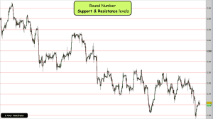
Probably the most obvious levels in trading are round numbers. Round numbers may be whole dollars and half dollars in stocks and commodities and 00 and 50 levels in indices and forex. Everyone can see them on their charts and therefore they are always likely to play a part when price is around them.
Seek round numbers out on your charts and plot your lines accordingly. You may like to assign a special colour of line to identify the different levels or a certain thinkness of line so that you can see them easily.
Go back on your charts and observe how price has reacted to these levels in the past.
Open, high, low, and close support and resistance levels
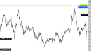
Referred to as the daily levels, the market open, high, low and close levels of the previous trading day can play an important part in the following days session and are certainly worth plotting by all day traders.
The daily high and low reflect the extremes of value during the previous day and the open and the close reflect where market participants perceived value to be at the beginning and end of the day.
Many orders are taken overnight and filled when prices reach these value levels during the trading day. Often they act like magnets for prices, sucking prices quickly up to them and then repelling them equally quickly.
Swing high and low support and resistance

Go to your preferred trading timeframe and use the historical information on your charts to identify where the market has turned in the past. These are the previous swing highs and lows.
You may like to condense the bars on the charts so that you can get the bigger picture and pull these levels out more easily.
Pick out the levels that have had the most influence over prices. There will be levels that have caused a reaction time and again. These are high probability support and resistance levels.
Go to a higher timeframe, say five times longer than your trading timeframe and notice where the market has produced spikes. Spikes are important in trading, these are the footprints of the institutional traders. They indicate where there is significant buying and selling supporting and resisting price movements.
Sometimes a market crashes down to a certain level in what would appear to be an unstoppable manner and then seemingly out of nowhere they stop and reverse. This is what causes the spikes.
When we can identify where the big players are supporting and resisting prices then we have a high probability level, they will likely (but not certainly) do the same thing again if prices revisit this level.
Pivot Point support & resistance
Finally we can easily add the Pivot Point indicator to our charts. The seven Pivot Points are calculated using the opening, high, low and close prices from the previous day. They tend to represent what the market may consider as levels of value and extremes of value.
When market price is in the vicinity of one of these levels it rarely passes the level without some kind of reaction. This is exactly what we would expect from a high probability support and resistance level.
Whether price passes through the level eventually or turns around, again we will need to wait and see. However having the levels on our charts gives us an advantage and further context for our trades.
Support and resistance levels provide context
So there you have it. Now you have your high probability support and resistance levels on your charts. These levels will provide you with context for market prices and context for your trades.
Now we have to wait to see how prices react in these areas to pick out trading opportunities.
I hope that you found this useful. If you have any thoughts or questions then please leave a comment below. I’d be interested to hear your thoughts?[/fusion_builder_column]

