The best trading candlesticks and how to trade them
Trading candlestick patterns can be a great way of getting in at the very start of a reversal, they can provide a way of spotting the lows in market swings and also the highs. Candlesticks can also give indications of buying and selling pressure in the market.
Candlestick patterns can be a huge clue to momentum in price action. I find them really useful, however before entering a trade using candlestick patterns I would recommend that you seek confirmation from other trading indicators or aspects of your system. A candlestick in the wrong context can be part of a trading trap, our charts are littered with bull and bear traps.
They are one huge piece of the trading jigsaw, however they are only one piece of the puzzle. I always look for a confluence of factors, including candlesticks before entering a trade. They are one important ingredient to your trading system.
Plotting your charts – Candlesticks
There are several ways of plotting price movements on a chart. The two most common methods are by drawing lines between opening, mid or closing prices and secondly by drawing candlesticks.
Plotting a line is easy on the eye. It is easy to see which direction price is heading in over time. Eg if the chart is plotted using closing prices and the closing prices rise over a time period then the line will point upwards. However it does not provide sufficient detail for many traders in that it only reflects one of the four key elements to price action, opening, closing or mid prices, ignoring completely the highs and lows. As a result It neglects to tell the full story of the psychology behind the price movement over a given period.
Candlesticks are used on their charts by most professional traders. The benefit of candlesticks is that they do give an incite into the psychology behind price movement over each time period.
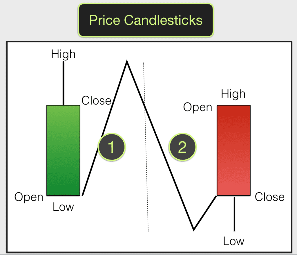
This is because candlesticks reflect the four most important elements in price movement, the opening price, the high, the low and the closing price for every time period.
If you are new to all of this then you will quite quickly get the hang of them. Candlesticks are either green, red or look like a cross. Green means that the closing price was higher than the opening price – price went up. Red means that the closing price was lower than the opening price – price went down. A cross reflects no difference between closing and opening prices – price was flat.
On live charts candlesticks are drawn as price develops during a time period. If the first move is up then the candle will turn green as price rises. If price then falls from its peak the candle will leave a wick, the top of the wick reflecting the high. If price falls below the opening price then it will turn red. Again if it turns up from the low then it will leave a wick at the bottom of the candle.
Most candlesticks (not all candlesticks) on a chart will have a wick at the bottom and the top when they are complete, these are often referred to as the nose and tail. At the end of the time period the next candle will plot alongside the previous one.
Candlesticks tell the story of the battle between buyers and sellers. If the candle completes as a big red candle then the sellers have control and momentum is on the downside. If it is big and green then the buyers have control and momentum is to the up side. If the candle has a long wick on one end then it tells us that there has been a reversal in power between buyers and sellers. One side taking control only to be beaten back by the other side. This could signal a change in momentum. This is how candlesticks reflect group psychology.
Some traders will take trading signals from specific types of candlesticks, others look for sequences of candlesticks to give them a signal. Most traders will use candlesticks in conjunction with other indicators. It is a confluence of factors (one confirming another) that gives traders their edge.
Candlesticks for different timeframes
There is a candle for each timeframe on a chart. One minute charts will show a series of one minute candles. Five minute charts a series of five minute candles. Daily charts show daily candles etc.
Lower timeframe charts often show a lot of “noise” in the price action, less consistency. Higher timeframes tend to show less “noise” and illustrate swings and trends better. Most successful traders trade with the trend. All beginners should aim to trade successful first of all with the longer term trend.
Going up, pausing, going down
Any market is either going up, going down or pausing. Longer and bigger candles indicate greater conviction and pressure in price action. Shorter and smaller candles indicate a pause for reflection. The longer the nose and tail on the candle the bigger the battle between buyers and sellers.
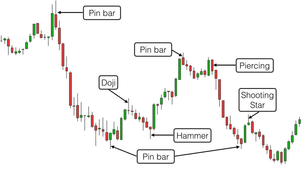
This chart developed on the FTSE 100 index whilst I was writing this article. This is a particularly good example (market action isn’t always as tidy as this). You can clearly see the Pin Bars and the Piercing Patterns poking out at the tops and bottoms of the swings. Note the false signals in the middle of the swings. Genuine Pin Bars, the first candle in a Piercing Pattern and reversal Dojis tend to have no candles directly to the left of them. With each of them the following candle on the chart breaks the extreme of the reversal candle, thus confirming their status.
You can also see on the chart how the reversal candles described appear where there has been previous congestion on the chart and previous reversals. You should always wait for confirmation before entering a trade and always look for a confluence of factors.
The 10 best candlestick patterns to trade
Here are the 10 most important trading candlestick patterns:
- Engulfing Candles
- Pin Bars
- Piercing Patterns
- Harami
- Doji
- Hammer
- Shooting Star
- Inverted Hammer
- Morning Star/Evening Star
Learn to trade using candlesticks as part of an efficient trading system in our Trading courses.