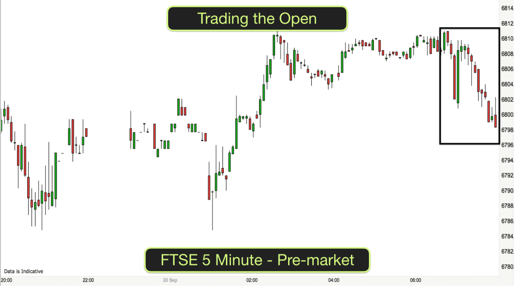
Two mornings and two very different trading conditions on the DAX index over the last two days.
Have a look at the charts above. On the face of it you might just see one chart on the left where the market is going down and another chart on the right where the market is going up. You would be right but the conditions in the market are completely contrasting.
Let’s take a closer look at what is going on and what type of trade management to use in order to trade these different conditions successfully.
Looking at the similarities first of all:
Both of the charts show the 5 minute morning price action on the DAX (German) stock index.
On both charts I have drawn in the 8, 20 and 90 EMA indicators.
Both charts have a lower double bottom at the bottom of the chart followed by a move upwards.
On the left chart (3rd May) the market trends down before the double bottom. The market is making lower lows and lower highs and price action is taking place below the 8, 20 and 90 EMAs.
On the right chart (4th May) the market makes the double bottom just after the open and then trends upwards. The market is making higher highs and higher lows and price action is taking place above the 8, 20 and 90 EMAs.
The differences are these:
Take a look at the numbers in the black ovals drawn on the right of the chart. There is a 5 point difference between the numbers on the chart on the right and a 20 point difference between the numbers on the chart on the left. This indicates that the Average true range or volatility on the chart on the right is nearly 4x what it is on the chart on the left.
What do you notice about the differences between the candlesticks on the two charts? Most of the candles on the chart on the left have big wicks on them, both at the top and the bottom of the candlesticks. On the chart on the right there are more solid candles with shorter wicks. This indicates greater momentum and less uncertainty.
Most of the candlesticks on the chart on the left are overlapping and alternate. Even though most of the price action is moving down the candles alternate between bearish (red) and bullish (green). Most price action on most candles also takes place within the high and the low of the previous candlestick. These are signs of a weak trend or trading range.
Whilst there are both bullish and bearish candles on the chart of the right, there is less overlap and less alternating between the two colours. Most candles are green and in fact after almost every red bar closed the price immediately went up (meaning that traders were buying the close of bear bars). This is a sign of strength.
Breakout trend bars – They are absent from the downtrend on the left chart. There is a big exhaustion bar near the first low and price pulled back to the high of this bar as traders started to exit their short trades.
The blue oval on the right chart highlights the breakout from the trading range at the beginning of the big bull trend. As often happens after a breakout bar, the breakout continued for several more bars.
Trading the different market conditions
There are several ways to day trade these different market conditions depending on what type of trading suits you best.
The EMAs – Swing traders
Notice first of all the on both charts when the 8 moving average crosses the 20 moving average this indicates a change in general market direction.
On the chart on the left the 8 EMA crosses below the 20 EMA out of picture to the left and just as we join the chart. The two lines stay apart until 11.30am and after the market had made the double bottom when the lines cross and the market starts moving upwards.
On the chart on the right the 8 EMA crosses above the 20 EMA at about 8.30 and just before the big move upwards.
Generally speaking, whilst the 8 EMA is above the 20 EMA the market is moving upwards and traders will be looking for long trades. Whilst the 8 EMA is below the 20 EMA the market is moving downwards and traders will be looking for short trades.
On both charts when the market moves back to the EMAs the majority of traders take trades in the direction of the longer term trend (downwards on the left from the 8 and 20 EMAs and upwards on the right from the 8 EMA). This is called selling strength in a downtrend and buying weakness in an uptrend).
Candlesticks – Shorter term traders and scalpers
Shorter term traders and scalpers are looking for quick moves in line with the trend.
As mentioned before, whilst the market is strong (after a big bull breakout) as it is on the chart on the right traders will buy any sign of weakness. They will buy below red bars. They will buy below green bars, they will buy the close of any bar as long as it is still making higher highs and higher lows. In this type of market any type of order to go long would work out, stop orders above bars, limit orders below bars, and market orders.
Looking at the chart on the left, stop orders would not have worked as well. Selling below the low of the previous bar would often have meant an uncomfortable time waiting as price pulled back to see if the market was going to make a new low. Limit orders would have worked ok. Selling above green bars with limit orders and selling green bar closes or red bar highs with market orders would generally have worked out ok.
As always I hope that you found this analysis useful. There are lots of ways to skin a cat as they say. The key with trading is to have a trading strategy that suits different market conditions and to have the knowledge to read price action so that you know what type of market condition exists at any one time. We will teach you all of this and more on our online trading course. Join us inside your course.