Chart patterns and how to trade them
- Would you like to learn about Chart Patterns and how to trade them?
- Would you be interested to learn what they are and how they form so that you can recognise one when it appears on your chart?
Great, then we have the answers for you. Dive on in.
One of the most interesting phenomenons in market price charting is the way that price appears to produce forms within the action.
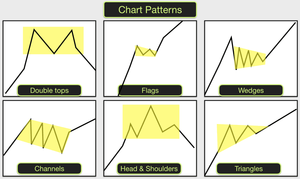
Triangles, flags, wedges, butterfly shapes, a head and shoulders, rectangles can all be observed within price movement. These shapes are often traded by technical analysts as they repeatedly occur in charts and they sometimes give clues as to the likely subsequent direction of price.
 For example, flags and pennants appear sometimes in the middle of strong price moves. Price stalls after a sharp move up. There is a short period of congestion and a flag or pennant form can be observed in the price action.
There is a chance that when this happens price is going to break out higher and continue with another sharp increase of similar length to the first leg of the move. This is potentially tradable price action.
One thing that I should point out early on is that they don’t ALWAYS produce the same results and they never produce identical results. Sometimes the trades work out and sometimes they don’t. This is the nature of trading. As with any trading strategy we are talking about a game of numbers and probability.
The probability of a move upwards or downwards in price and the likely size of the move (potential gain) following a chart pattern must be judged against the risk involved (potential loss). Each trade should be judged on its own merits.
Every market behaves slightly differently and in some markets certain patterns are prevalent, in others they are rare. You should get to know a certain market or a couple of markets really well and pay attention to the chart patterns that appear most regularly and how price reacts when leaving the pattern. This can be done in realtime using live charts or you can backtest a market. I would recommend doing both.
Some of the chart patterns complete successfully less than 50% of the time. This can still be ok in terms of trading them as long as the risk/reward from the trades is right. Eg If you notice that a certain pattern on a market completes successfully 45% of the time and the risk/reward is 1:2 on average with these trades then it can still be a profitable exercise to trade them.
Read more on:
- Day Trading Chart Patterns – a blog and practical analysis of trades and opportunities in various financial markets.
- Triangles

- Flags & Pennants
- Wedges
- Head & Shoulders
- Double/Triple tops & bottoms
- Pipe Tops & Pipe Bottoms
- Inverted and Ascending Scallops
- Three Rising Valleys
- Cup & Handle
- Measured Moves
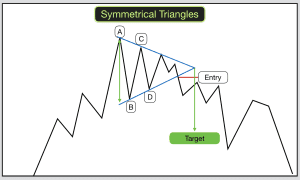
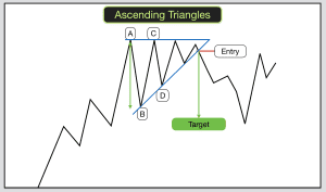
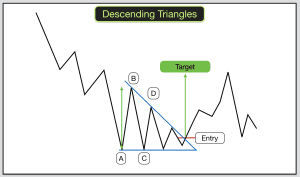
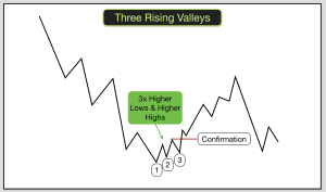
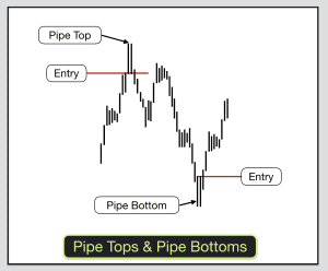
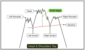
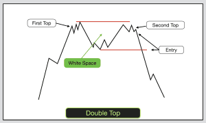
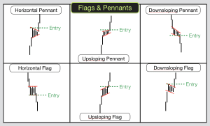
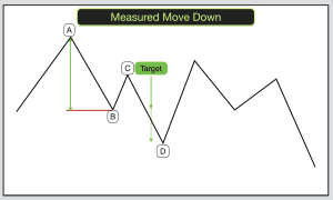
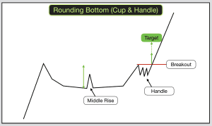
Chart Patterns – Price congestion areas, Support & Resistance and Trendlines
Most of the chart patterns occur as a result of congestion areas. These are areas of price action where there is a tussle between bears and bulls. As we know price congestion doesn’t last for ever and eventually either the bulls or bears will gain control for a period of time. When price breaks out from the congestion area this is the trade.
Within the congestion area there are often horizontal Support & Resistance levels. These form the shapes EG Triangles with a flat bottom. The other sides of triangles and the sloping sides of rising and falling wedges, and flags can be identified by plotting Trendlines connecting the highs and lows in the area.
Each chart pattern has certain rules associated with it. When the pattern meets the rules and price subsequently behaves the way that it is expected to then this may be a tradable chart pattern.
Why do chart patterns appear? Psychology in trading
As with most things in trading this all comes down to psychology. Traders avoidance of fear and the magnetic attraction of greed.
If sufficient traders act in the same way at the same time then price will move.
For example, a triangle appears on a chart. It meets the criteria. Traders wait for price to confirm an upward breakout from the triangle of congestion. Price starts moving upwards. Huge numbers of traders see this happen and place buy orders. There are not sufficient sell orders to consume all of the buy orders (fear of selling too early and missing out). Price moves upwards to a level where some traders are prepared to sell (fear of price falling back). Greedy buyers mop up these sell orders and price moves upwards to the next level.
Two of the key aspects of price congestion areas are that they heighten emotions in committed traders and the number of non-committed traders (prospective buyers and sellers) increases.
In congestion areas price moves up and down in a tight range. This creates uncertainty amongst traders. Committed bears become fearful that they will lose money when price rises and committed bulls fear that they will lose when price falls. Each of them is hoping that price will breakout from the congestion area in their direction.
As the shape forms from the price action and the congestion continues so bears and bulls set stop orders to limit their risk should price breakout against them. This is often above the top of the congestion area in the case of the bears and below the bottom of the congestion area in the case of the bulls.
Fearful traders will sometimes see price approaching their stop level and they will bail out early only to see price reverse in the direction of their trade without them. They add their names to the list of non-committed traders.
Learn how to trade chart patterns
Some professional traders will “fade” these mini moves buying at the low of the congestion area and selling at the top of the congestion area, selling at the top and buying back at the bottom. Thus the congestion areas sustain themselves sometimes.
Traders waiting on the sidelines will observe the price movement within the congestion areas with interest. They will create if/then statements that will trigger trades. EG If price moves to such and such a level then I will buy. If the next price period creates a lower low then I will sell.
Often these congestion areas are punctuated by false breakouts or “fakeouts”. EG Price feigns to break lower. It creates the lowest low in the congestion area. It takes out the stops of the over-cautious bulls. It also triggers the buy orders of the professional traders looking for a quick scalp, they “fade” the breakout buying at the bottom and ride price back upwards and into the congestion area.
On candlestick charts these “fakeouts” often produce candles with long tails or spikes that poke out of the congestion area. These are often viewed as reversal candles by traders and may trigger a price move in the other direction.
When price gathers sufficient momentum in one direction the real breakout takes place. Lots of non-committed traders will see this occurring and jump into trades in the direction of the breakout thus completing the chart pattern.
When price breaks out of congestion areas and chart patterns it often moves very quickly and in order to trade them successfully you will need to have quick reactions of you are operating in the day trading environment.
These patterns appear on charts of all timeframes so you can pick the timeframe that suits your trading style and the time that you have free to trade.
For more examples and demonstration of how to trade these patterns join us on our online Trading courses.